Data visualisation has always had importance in social sciences. Visualising data has several advantages including but not limited to making sense of complex issues in an easier and appealing way. This post will serve as a tutorial for researchers and enthusiasts around the world who are interested in making sense of Twitter data and visualising social networks in general.
For this step-by-step tutorial, we will use Netlytic and Gephi.
Netlytic is a free platform to download information on the web and make basic analyses on the obtained data. It works on several popular social network platforms like Twitter, Facebook, YouTube and Instagram. It also supports text files and spreadsheets to analyse data. Data obtained via Netlytic can be used in most other network analysis platforms.
Gephi is an application that works on Windows, Linux and Mac OS used in statistical analyses and visualisations of networks. It also has many different tools to import/export data in various formats usable in other platforms.
Step 1: Register for Netlytic, Download and Install Gephi
The descriptions have links to allow you to register for Netlytic and Download Gephi.
Registration for Netlytic is free and simple. Netlytic has three ‘tiers’.
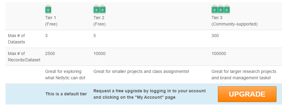
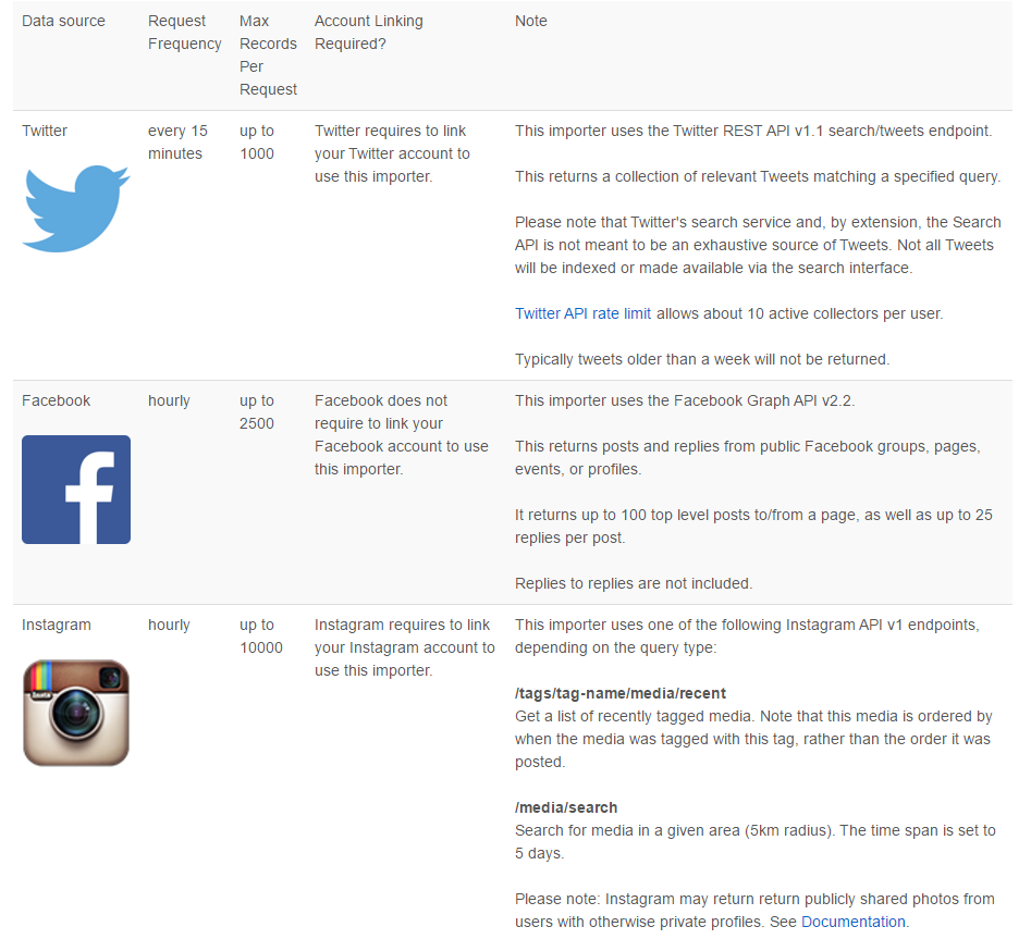
There are various limitations for collecting data on different platforms. Netlytic is very informative about these limitations.
After you register your account, apply for a Tier 2 account and obtain it, you are good to go. Having a Tier 2 account is important. Most trending topics on Twitter start with 50,000 tweets and top trending topics usually have a few hundred thousands of tweets. A data set consisting of 10,000–50,000 tweets on a hot topic is statistically ‘representative enough’ (at least for network analysis). You might be able to achieve most of the things you are planning to achieve with 2,500 tweets, but 10,000 is better (therefore more representative) than 2,500, isn’t it?
Downloading Gephi is simple for Windows and Mac OS users. Linux users have to use the terminal and have a basic understanding of installing applications in tar.gz format. Let’s not forget that you must have Java installed on your system. The latest version of Gephi is the version 0.9.1 at the time of writing this tutorial. Gephi has been around for years, but it is still in Beta. While it works like a charm most of the time, it still has issues for some (mostly older) systems and builds. So, don’t forget to save your projects regularly so you can reach them later if a problem occurs.
Important: After you are done, go to ‘tools > plugins’ and download all the available plugins. Check for updates and update your application if necessary.
Step 2: Configure Gephi Memory Settings
In Windows, you will find the gephi.conf file under the ‘etc’ folder in Gephi-0.9.1 under Program Files. You can edit this file with Notepad or any other text processing application. Here is what you should see:
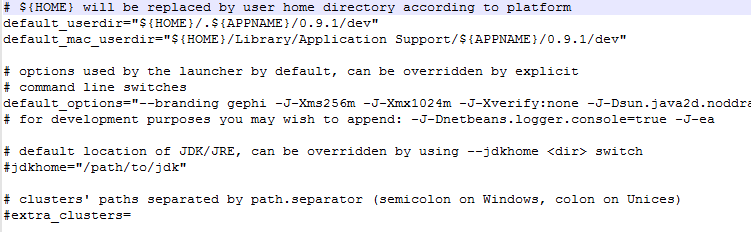
Sometimes, even if your system has enough memory to run Gephi, it just won’t start. For example, my system has 12 gigs of RAM, but Gephi won’t start if I set the maximum memory to 2 gigs. It’s just a problem with my specific configuration. If you can’t run Gephi after double-clicking on the icon, try changing the memory allocation.
Step 3: Collect Tweets
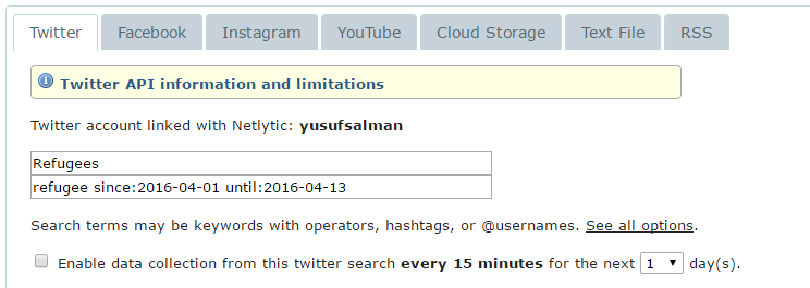
There are many ways to download tweets in different file formats. Netlytic is free and easier for many people who wouldn’t need more than 50,000 tweets for their research. To collect tweets that match your specific requirements, we will use Twitter’s advanced search function. You can use the page on this link.
Via this function, you can set various properties to reach what you want to reach. For this tutorial, we will use the word ‘refugee’ and collect tweets posted between 1 and 13 April.

When you click on the ‘search’ button, you will see your search query in a standardised format.

Now that you have your string to collect your tweets, go to Netlytic to create a data set.

Copy and paste your search query under Twitter on Netlytic.
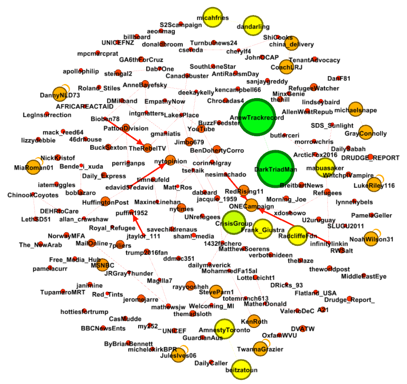
Let’s move on. If you go to the ‘network analysis’ tab on Netlytic and run the analysis, you end up with a graph! Graphs are cool. They contain information on how units in a network are connected.
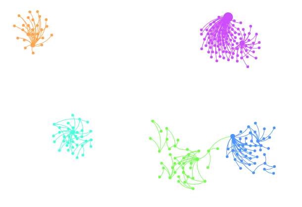
This initial network analysis can help you notice the ‘elephants in the room’ and obtain basic information about the network.
Step 5: Export Your Graph
Now that we have collected our tweets, we will move on to export our graph to be used in Gephi. There are many options to choose among the file formats supported by Netlytic for export. We will click on ‘export’ on the following screen and choose GraphML. This file format works in Netlytic, Gephi, NodeXL and many other platforms. Netlytic will e-mail you a link to the file when it is ready.
Step 6: Open Your Graph File in Gephi and Run the Essential Statistical Tests
After opening our Graph file (it will automatically detect the graph as a directed one, but if it doesn’t for any reason, just select ‘directed’), we will see the following initial screen.
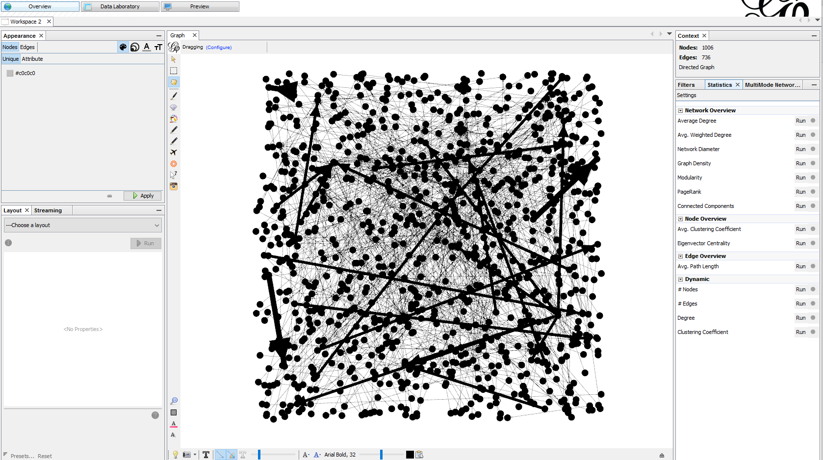
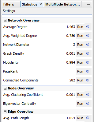
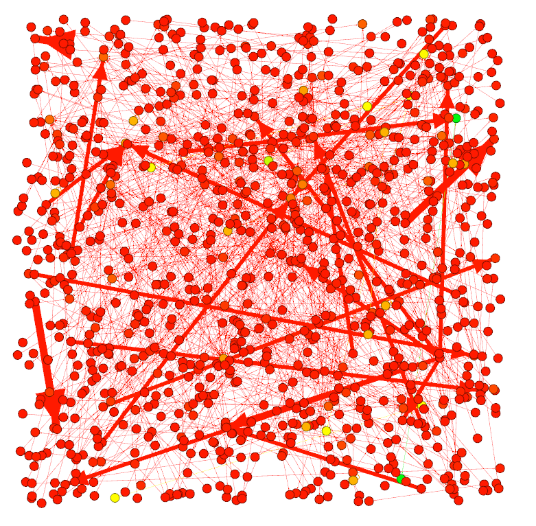
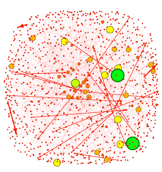
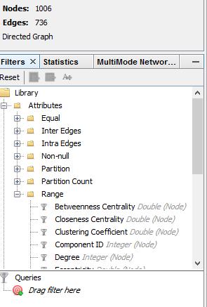
At his stage, the graph is a mess. We will have a chance to make it look much better, but we have to run the statistical tests on the right side of the Gephi window.
Basically click on everything you see in this section.
Let’s go back to the ‘Overview’ tab, because our graph is still a huge mass.
Step 7: Make the Graph Look Better
This part really depends on your choice of statistical tool of comparison, artistic views and what you want to show.
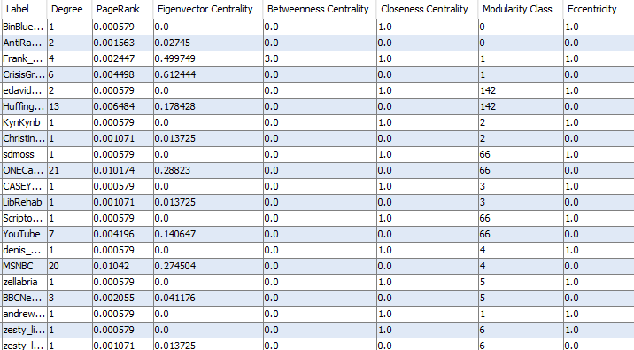
The importance or influence of units (nodes) in a graph is measured by their centrality. Here are some basic ways of understanding centrality (in very, very simple terms):
Degree
Number of connections a node has. If you are working with a directed graph (like Twitter mention networks), there are two other concepts: indegree and outdegree.
Closeness Centrality
Demonstrates how close to others a node is. It is based on the total length of all shortest paths to other nodes.
Betweenness Centrality
Demonstrates how much a node acts like a bridge to all others.
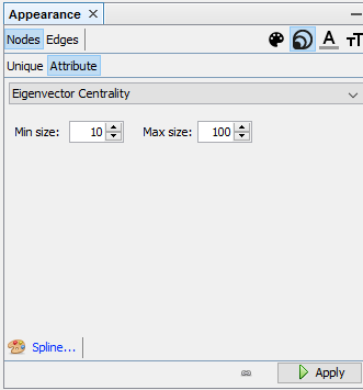
Eigenvector Centrality
Importance of a node is dependent on the importance of the nodes it is connected to.
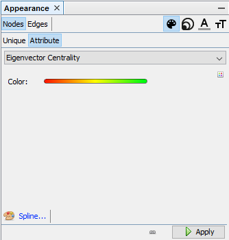
For this example, I will use Eigenvector Centrality to measure the importance of users in the network.
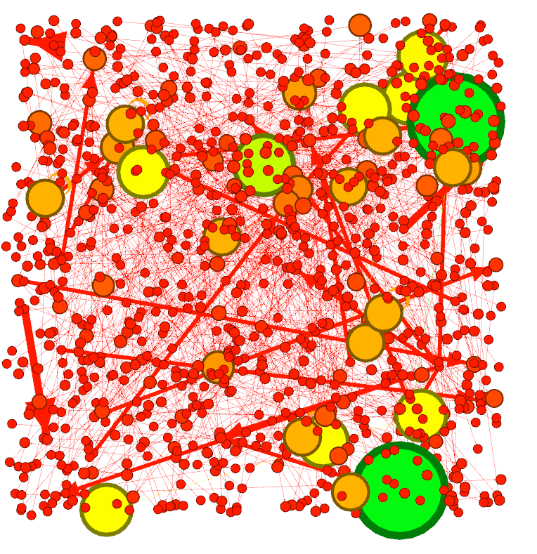
Let’s shape up our graph, starting with the colours.
Let’s adjust the sizes.
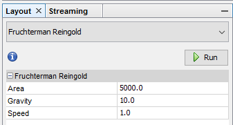
This part is where our layouts and plugins come handy. Gephi offers various different layouts to present your graph and a few plugins to make it look better. For this example, I will use one of the most popular layouts: Fruchterman-Reingold. It’s a force-directed graph algorithm and it will give us a clear view of the connections in our graph. Let’s not forget that we are also able to change different parameters before executing these algorithms.
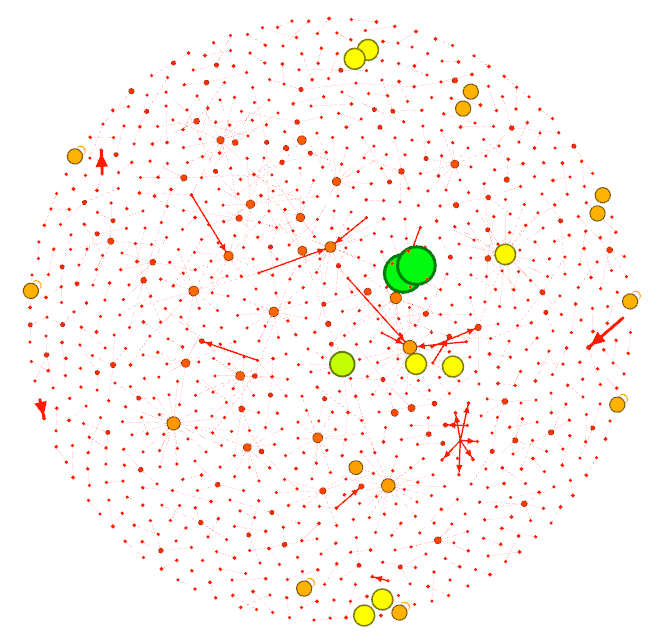
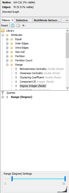
I will eliminate all nodes with only one connection each and run the algorithm again. This will clear up my graph (while not affecting the statistics).
Let’s run the algorithm again.
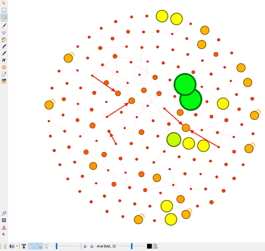
Let’s add labels (usernames). Click on the text symbol (bold ‘T’ in black) in the bottom-left corner of the main window.
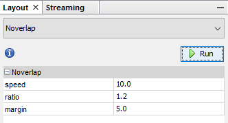
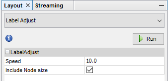
You might have noticed that some nodes and labels overlap and it makes them harder to view. Gephi has a solution for this.
Step 8: Final Touches and Exporting the Graph
In this last step of our network visualisation, we should have regularly saved our project to avoid loss of data. As I mentioned earlier, Gephi is still unpredictable and unstable, and you might experience crashes, freezing, hanging, etc. Fortunately, during the preparation of this tutorial, I haven’t experienced any of these. You just might. Save your work!
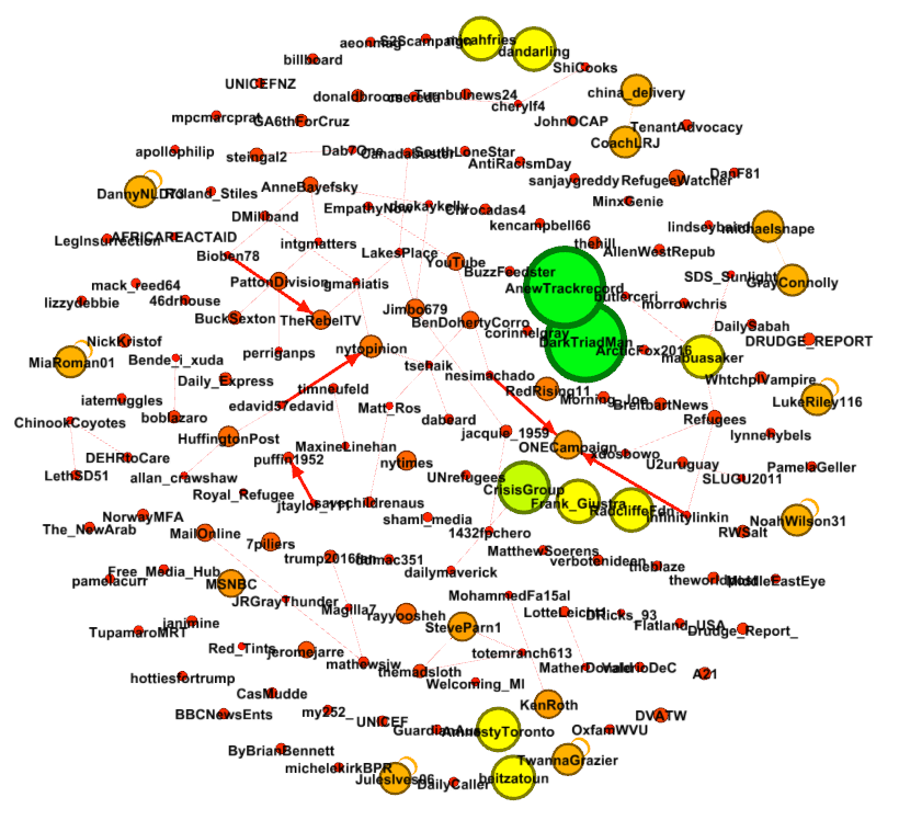
For creation of our final product, let’s click on the ‘Preview’ tab at the top of the window.
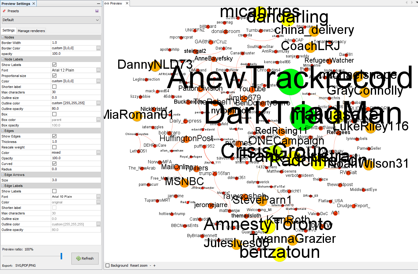
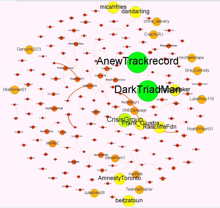
The rest, truly, is cosmetics. You might notice some overlapping on the labels. Sometimes, adjusting the sizes fixes the issue. Sometimes, you have to go back and manually adjust the positions of your nodes to create the best looks. I won’t do any of these here.
Once you’ve decided on the final appearance of your graph, you are ready to export it. These images can be exported as PNG, SVG or PDF files. The entire project can be exported as graph files and text files.
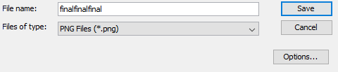
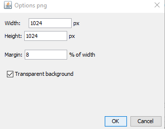
Let’s click on file > export > SVG/PDF/PNG and export our image.
At this point, you are done! Don’t forget to save your project file before quitting the application so you can use all the statistical information later. Don’t forget that you can export your graph in other formats usable in other platforms.
Cheers!
—
If you have questions or anything to say, leave a comment!
Link to the original post. <— You can also find out about supporting me here. Or… you can use this information —> HERE.
Leave a Reply to Mila Cancel reply